Rob Phillips Dorit Maor
Computing Centre Science and Mathematics Education Centre
Curtin University of Technology Curtin University of Technology
GPO Box U1987 GPO Box U1987
Perth WA 6001 Perth WA 6001
r.phillips@info.curtin.edu.au d.maor@info.curtin.edu.au
This paper reports on a project to represent a scientific database of physical and biological observations of birds in Antarctic waters in a visual form using various interactive multimedia (IMM) techniques. A situated learning approach has been used, based on a constructivist framework, with scaffolding to guide students in developing their own inquiry skills.
The IMM program simulates the ship-board environment, while providing user-friendly access to a complex range of database query and report-generating procedures. A further key requirement of the design was the ability for the student to record their own observations and graphs and prepare their own report about their conclusions.
The paper discusses the development of the user interface design based on these considerations.
For several years, one of the authors has been involved in classroom research into the use of computerised databases of scientific data from Antarctica as a vehicle to promote scientific inquiry skills among secondary students[1, 2] . Maor found that difficulties in use of traditional database packages formed a barrier to the use of scientific inquiry. The boolean queries required, together with other user interface issues, directed cognitive effort away from the task at hand. This project reports the use of interactive multimedia visualisation techniques to provide multiple representations of the data in a similar database of actual data from Antarctic voyages.
The data used in this project is authentic scientific data of physical and biological observations of birds recorded on voyages in Antarctic waters by expeditions of the Australian Antarctic Division. This is a very rich source of data, but because it is real rather than simulated, it suffers from omissions and errors in recording.
Initial classroom research[1] on Antarctic scientific data was based on a character-based computer program called "Birds of Antarctica", produced in 1984 by the National Information Technology Council[3] . In the original version, students used this program in conjunction with a 71 page student workbook, which took them through several investigation processes[1] . The user interface of this program was not at all intuitive. To make a query, students had to enter a string of the type:
sp = 1 and ic > 4.
This translates to: select the data where the bird species is 1 and the ice state is greater than 4. Students then also had to know that species 1 was Emperor Penguin, and that ice state 4 was 3/8 to 5/8 pack ice.
While some interesting research results were obtained from the study using this program, students had great difficulty in focussing on the scientific investigation aspects of the task, because they had to invest so much effort in coming to grips with the syntax of the queries.
In 1993, a second program was written in Foxbase for the Macintosh computer, based on the same type of database queries. The aim was to enable queries to be stated in a more user-friendly manner than previously. This was achieved in part, but some errors in the specification of the program resulted it being of marginal use for a wide range of investigations. However, a case study conducted by Pitts [4] revealed that a small number of students were successful in interrogating the data base and conducting useful queries.
Both programs used selection from the database as the main analysis tool. While limited graphing functions were available, the principal interrogation method was that of selecting records from the database.
Analysis of the types of investigations contained in the workbook for the first version indicated that queries compared at most three variables. At the simplest level, this may consist of one variable, such as the wind force. Users would determine the number of observations at wind force 1, wind force 2, etc., and record these in a table.
At the most sophisticated level, users would choose a specific value for one variable(e.g. species is Snow Petrel) and investigate the relationship between two other variables, for example wind force and air temperature. Once again, students would manually make up a table from individual database queries.
Analysis revealed that the same amount of information could be presented in a more easily understood, visual way by the use of graphs and an interactive map.
The frequency distribution of observations at different values of wind force can be simply displayed as a histogram, rather than by manually building up a table of values. This provides an overview of all possible values at the one time, and allows trends to be observed.
Relationships between two variables can be expressed as a scatter plot for continuous variables, and as a two-dimensional frequency plot for variables containing categorical data, such as the Species. The two-dimensional frequency plot is made up as a table with each cell in the table showing the number of observations at the given value for the x- and y- variables.
An alternative way to investigate the relationship between two variables is to select one of them, and then create a histogram on another variable.
A similar approach can be used for comparing three variables. That is: select on one variable, and use one of the two two-dimensional graphing techniques to compare the other two variables.
The fourth way that information can be presented is by use of an interactive map of the progress of the voyage. Each individual observation can be interrogated by clicking on the point on the map corresponding to that observation.
The analysis described above indicated that the types of information required from the scientific database could be displayed using several types of graphs and an interactive map, with minimal use of explicit database queries. The general approach taken was to summarise sets of data in graphical form, rather than by individually collecting numbers.
The question was then: how to implement an IMM program to visually represent the database of physical and biological observations of birds in Antarctic waters? [5]
The Science and Mathematics Education Centre at Curtin University has been a leader in research into the effectiveness of constructivist learning environments [6-8] , and based on the experience of earlier studies [1, 4] it was fairly natural to adopt such an approach in the development of this program.
The theoretical framework behind the instructional design is described in more detail in [5] , but the important factors were: to use a situated learning approach; with a scaffolding approach to guide students in their learning; and to provide for social construction of knowledge.
The constructivist approach was implemented in a situated learning environment [9]. This approach attempts to place the learning activity in an environment that closely parallels a real world situation, essentially in an authentic context that reflects the way that knowledge will be used in real-life[10] .
In this case, the actual observations taken by Australian Antarctic Division staff occur on board supply and research vessels travelling to and from Antarctica. Therefore, we chose to simulate this ship-board environment. Our challenge was to produce such an environment while still providing user-friendly access to a complex range of database query and report-generating procedures.
Part of the Situated Learning approach is to provide coaching and support to students at critical times [10] . Gradually, the support is removed until students are able to stand on their own.
In this project, the amount of data available and the range of behaviour of the data lead to a very complex environment. The earlier study described in section 1.1 identified problems with students coming to grips with the complexity of the data, and the interrogation skills needed to access it. While the program described here was designed to simplify this complexity, the complexity is still present, and therefore students need guidance in coping with it. A guided tour was designed especially to help students use the different options of the program and to navigate through the program. This is currently in written form, but in the future will be an integral part of the program.
After the user becomes familiar with the technical use of the program and can easily navigate through the various data (e.g. observational data and display data), the user is introduced to the steps of scientific investigations suitable to the constructivist learning environment. This guides them in planning and conducting investigations. The expert user, by now, is able to explore and design any investigation within the simulated learning environment.
A range of techniques were explored to implement these levels of guidance in a form consistent with the rest of the user interface.
A particularly strong impetus for the design was the ability of the program to support collaborative construction of knowledge, through social constructivism [2] .
It was very important that students using the program be given the opportunity to reinforce their learning by making notes and writing their own reports, so that these reports may be reviewed and negotiated by other students and the class teacher[11] .
There were several complications in the design of the electronic notebook which are discussed later in this paper.
On each voyage, observations are taken approximately every hour. 29 variables are recorded in the database of over 60,000 observation records, made up of more than 40 voyages. The 29 variables can be divided into 6 broad categories (Location, Chronology, Navigation, Meteorology, Ice and Sea, and Observation), as shown in Table 1. The data behaves as follows:
ï The Navigation, Meteorology, Ice and Sea categories are observations of Physical variables.
ï The Observation category is a Biological observation.
ï There is a 1-1 relationship between Physical observations and Location and Chronology.
ï There is a n-1 relationship between Biological observations and Location and Chronology, because more than one bird observation may be recorded at any one observation time. e.g. an Albatross and a Petrel may be observed during the one recording session.
ï There are 4 types of variables, which we call continuous, circular, categorical and discrete. This distinction is necessary to clarify the behaviour of Selection and Graphing.
Continuous data are real numbers (e.g. Air Temperature). A subset of continuous is Circular, e.g. wind direction, which goes smoothly from 359 deg. to 0 deg. Discontinuous data can be divided into 2 categories, depending whether the data values cover a monotonically increasing range (discrete) or are logically distinct (categorical). Thus Species is categorical because there is no logical order, and Wind Force is discrete because force 2 is clearly greater than force 1.
Because of the complexity of the data, some assumptions were made to simplify the students' task and streamline the user interface design:
ï Only one voyage of the many available could be investigated at any one time. This restricts the user to a subset of at most 2000 records of the database. Some recorded voyages with larger amounts of data were not included in the working database.
ï Selections from the data could only be made on one of the
29 observed variables at a time. The analysis in section 1.2
indicated that one selection is sufficient to perform the required
level of investigation. Allowing more levels of selection (i.e.
selection within a selection) would add extra complexity without
adding more power to the design.
| Location | Latitude | Continuous |
| Longitude | Continuous | |
| Chronology | Date | Continuous |
| Time | Continuous | |
| Navigation | Course | Circular |
| Speed | Continuous | |
| Activity | Categorical | |
| Meteorology | Precipitation | Discrete |
| Cloud | Discrete | |
| Visibility | Discrete | |
| Wind Force | Discrete | |
| Wind Direction | Circular | |
| Air Temperature | Continuous | |
| Air Pressure | Continuous | |
| Ice | Icebergs | Discrete |
| Sea Ice | Discrete | |
| Sea | Sea Temperature | Continuous |
| Sea State | Discrete | |
| Sea Depth | Continuous | |
| Salinity | Continuous | |
| Observation | Species | Categorical |
| Bird Count | Continuous | |
| Behaviour | Categorical | |
| Distance | Discrete | |
| Age | Discrete | |
| Observation Code | Categorical | |
| Bird Direction | Circular | |
| Table 1. The observation variables and their characterisation. | ||
ï The number of variables available for interrogation by novice and intermediate users would be restricted. Novice users should only have access to some variables, with more variables becoming relevant as experience and skill increases. Novice users therefore see a simplified view of the 'world'.
ï Similarly, novice users would only have access to some voyages.
A relational database model has been used to describe this data structure. There is a small database of voyages (containing vessel names and seasons), and two large databases, Physical and Biological. The Physical database contains the Location, Chronology, Navigation, Meteorology, and Ice and Sea categories, while the Observation category is stored into the Biological database.
It was found that a relational database schema was necessary because a simpler, flat-file structure led to unacceptable response times, due to the size of the data.
Since the program was about a voyage to Antarctica, and a situated learning approach was adopted, the basic user interface chosen was that of a ship. The student plays the role of a junior researcher on a simulated voyage to Antarctica, and is guided in his or her work by a senior scientist who acts as a mentor.
Actual biological observations are made and displayed from an observation deck, and navigation occurs on the bridge, while most of the inquiry work is performed from a laboratory on board the ship.
The ship environment has been designed in some detail on paper, but only the laboratory part has been implemented to date, because this is where most of the scientific inquiry work and database access occurs. Our effort to date has focussed on the design of the user interface of the data visualisation and analysis functions.
The program has been developed for the Apple Macintosh in Oracle Media Objects, using the dtF SQL database external command.
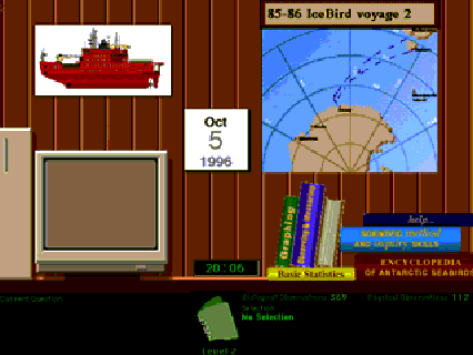
In the laboratory (Fig. 1), data can be displayed and summarised in a number of ways. The main elements are the map and the 'computer'. Background information can be obtained from a series of books on the desk. Information about the user's current status is displayed in the black status bar at the bottom. The user can record their investigations in the notebook located in the status bar. The map is used to display individual records of data, while the 'computer' is used as a mechanism for summarising and analysing sets of data with graphs and tables.
An initial design attempted to display both map and computer information on the same screen, but individual elements were too small to read. In the current design, the user clicks on the map or the computer in the laboratory and they pop up as separate screens in front of the laboratory, providing sufficient space to display all required information.
The following sections describe some of the features of the map and computer.
The map provides a visual overview of the entire voyage, by displaying the location of each observation on the voyage (Fig. 2.). Users can click on any location to display the observations at that point in the control panels at the right.
The map is most useful to novice users, who can come to grips with the scope of the data simply by browsing it. This exploratory activity may raise questions in the student's mind that can be clarified into hypotheses by appropriate guidance, either from the program or from the teacher.
However, answers to questions raised are more likely to be found by use of the analysis tools in the computer.
The computer is used for analysis of sets of data from the database. Data may be graphed in several ways, or displayed in a spreadsheet. Subsets of the data may be interrogated by first selecting according to a given criterion. The four types of graphs are described below.
The histogram investigates the behaviour of one variable. It
is used to show frequencies of observation in each category of
the chosen variable, and an example is shown in Fig 3. The entire
behaviour of one variable is shown at once, and trends can easily
be identified.
Figure 1. The laboratory on the simulated ship.
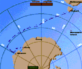
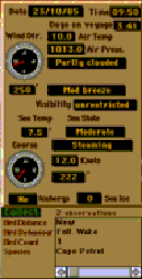
Figure 2. A representative map of a voyage to Antarctica.
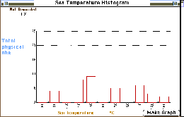 Figure 3. A representative frequency histogram.
For example, in Fig. 3, it can be easily seen that the minimum sea temperature was -5_C, most observations were made when the sea temperature was around -1_C, and the maximum temperature was 15_C.
The stacked bar graph is related to the histogram and also investigates the behaviour of one variable. The difference is that the stacked bar graph compares the behaviour of a variable when a selection has been made of the database with the behaviour of that variable over the entire set of data.
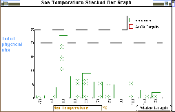 Figure 4. A representative stacked bar
graph.
Figure 4. A representative stacked bar
graph.
In creating Fig. 4, data was retrieved for Adelie Penguins, and a graph was made on sea temperature again. The dotted area shows the total histogram, and the clear area shows that 10 Adelie Penguins were observed, all when the sea temperature was -1_C. This observation can lead to a range of hypotheses which can be tested in a number of ways. A possible hypothesis is that sea temperatures of <0_C imply ice is present, and Adelie Penguins are only observed near ice.
The scatter plot shows the relationship between any two continuous or circular variables. A point is drawn at the location determined by the x- and y-values. Scatter plots can only be sensibly formed when both variables are continuous or circular, because both axes are made up of real, continuous numbers.
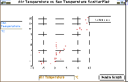
Figure 5. A representative scatter plot.
The scatter plot shown in Fig. 5 compares sea temperature with air temperature. It can be seen that there is largely a correlation between the two variables, which confirms our 'common sense' interpretation that sea temperature will fall as the air temperature decreases.
Scatter plots are less informative for categorical and discrete variables. These variables are combined into categories so that for example wind force 5, which is a 'fresh breeze', corresponds to wind speeds of 17 to 21 knots. Because several individual wind speeds may be combined into the one category (wind force 5), these would be plotted on top of each other in the scatter plot. The student has no idea how many observations appear on a given point on the graph.
The two-dimensional frequency plot shows the relationship between any two variables. It avoids the problem of scatter plots on discrete and categorical variables by calculating the number of observations at each point on the grid formed by the x- and y-axes. In the implementation used here, the frequency that each variable occurs for each value of the x- and y-variables is displayed as a number at each grid point, as shown in Fig. 6.
Fig. 6, like Fig. 5, compares air temperature and sea temperature. The correlation between the two variables is still visible, but additional information is present in that the frequencies can show the student conditions at which many observation were made, for example. The two dimensional frequency plot is essentially the most powerful data analysis tool available in the program.
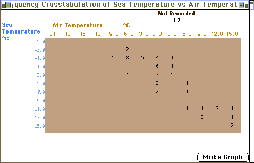
Figure 6. A representative two-dimensional frequency plot.
Students can also directly look at tables of actual data recorded in the database. This may be chosen in the broad categories described in Table 1, or in any combination the student desires. This tabular data display may be used to verify conclusions drawn from the use of other functions.
Implicit in the constructivist approach is that students build their own understanding of the subject matter. In this case, that means constructing a coherent argument from the observations made in their investigation.
In section 2.3 we also discussed the importance of students discussing their conclusions with colleagues and negotiating a shared understanding. There needs to be some mechanism whereby students can record their work and write it up into a report.
In this program, this was achieved by the use of an electronic notebook, available at all points in the program. Students can collect information into their notebook at any time, and then later open the notebook and add their description of what occurred, and their interpretation of it. The notebook developed here was similar to, but not as sophisticated as, the one described by Harper et al. [11] .
In this case it was particularly important that students collect pictorial information, such as graphs and maps, because these are the main analysis tools from which conclusions could be drawn. This situation is unlike most other implementations of notebooks in IMM programs, where only text is collected. Collection of text is particularly simple in most common IMM authoring environments, but the insertion of graphics is much less straightforward.
The notebook is shown in Fig. 7. The student's ideas are written
into the area at the left. Each resource that is collected is
given a name by the student and shown in the list at the bottom
right. The most recent resource collected is shown in the Resource
Viewer at top right. Only one graphic can be viewed at a time,
by clicking on the list of resources. If students want to refer
to a particular graphic, they simply drag the name of the graphic
from the resource list to the text area, and the name is inserted
there.
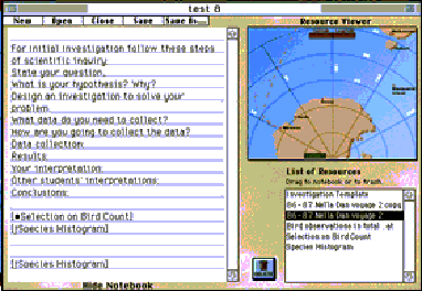
Figure 7. The electronic notebook.Each notebook is stored as a separate folder on the hard disk, and contains the text in one file. Graphics such as maps are collected by copying them to PICT files, and are stored in the same folder. The reason that all resources are collected into one folder is that on saving the notebook, it is also saved as an HTML file with links to the graphics referred to in the text. The HTML can then be accessed by the world-wide web, and the student's report can be read and discussed by other students and teachers, wherever they may be.
This paper discusses the background to, and details of, the user interface design of the Birds of Antarctica program. The aim of the project was to develop an intuitive interface to a complex source of data. The user interface is of a laboratory on board ship in which data can be displayed on a map or on a 'computer'.
The map provides a visual overview of the entire voyage, displaying individual records from the database.
The computer is used for summaries and analysis of sets of data from the database, by the use of a series of graphs and tables.
Students record their observations and conclusions in a notebook which can display images as well as text. The notebook can be made available to other students for discussion.
[1] D. Maor, ìAn Interpretive Study of the Development of Students' Inquiry Skills in a Computerised Classroom Environment from a Constructivist Perspective.,î Ph. D. thesis, Science and Mathematics Education Centre. Perth, Australia, 1993.
[2] D. Maor, Taylor, P., ìTeacher Epistemology and Scientific Inquiry in Computerised Classroom Environments,î Journal of Research in Science Teaching, vol. in press, 1995.
[3] ìBirds of Antarctica, Antarctic Science Database,î National Information Technology Committee: Elizabeth Computer Centre, Hobart, Australia 1984.
[4] M. Pitts, ìA Case study of the Implementation andEevaluation of Computer Software,î Masters thesis, Science and Mathematics Education Centre. Perth, Australia: Curtin University, 1994.
[5] D. Maor, Phillips, R. A., ìDeveloping a Multimedia Package for Teaching Thinking Skills,î presented at Third International Interactive Multimedia Symposium, Perth, Western Australia, 1996.
[6] D. Maor, Fraser B. J., ìUse of Classroom Environment Perceptions in Evaluating Inquiry-based Computer-assisted Llearning.,î International Journal of Science Education, vol 18, pp 401-421, 1996.
[7] P. C. Taylor, Fraser, B. J., Fisher, D., ìMonitoring constructivist classroom learning environments,,î International Journal of Educational Research., in press.
[8] P. C. Taylor, . Fraser, B. J., White, L. R., ìThe Revised CLES: A Questionnaire for Educators Interested in the Constructivist Reform of School Science and Mathematics.,î presented at Annual meeting of the American Educational Research Association, Atlanta, USA, 1994.
[9] J. S. Brown, Collins, A., Duguid, P., ìSituated Cognition and the Culture of Learning,î Educational Researcher, vol. 18, pp. 32-42, 1989.
[10] J. Herrington, Oliver, R., ìCritical Characteristics of Situated Learning: Implications for the Instructional Design of Multimedia.,î presented at Australian Society for Computers in Learning in Tertiary Education, Melbourne, Australia, 1995.
[11] B. M. Harper, Hedberg, J.G., Wright, R.J., Corderoy, R.M.,
ìMultimedia Reporting in Science Problem Solving,î
Australian Journal of Educational Technology, vol. 11,
pp. 23-37, 1996.